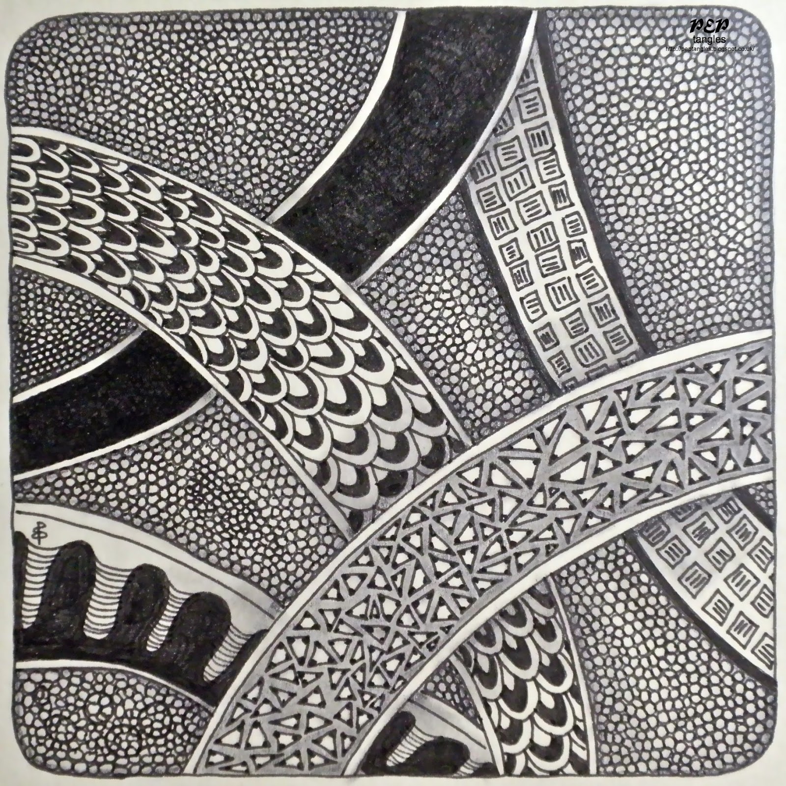
Black & white is the traditional format for a Zentangle tile & I certainly find it to be the format in which tangling can be carried out anywhere with a minimum of supplies. I also found that once colour is introduced the whole process becomes much more involved with the need to think about whether colours work with one another or not. There is also the added complication of whether various media are compatible with each oher - after a couple of tiles with black smudgy messes I discovered that the Letraset Fine Line Drawing Pen (Waterproof Non Fading Pigment Ink) bleeds when used in conjunction with the Tombow Blender Pen whereas the Sakura Pigma Micron (Archival Pigment Ink waterproof & fade proof) does not providing one allows it a few minutes to dry.
The whole ethos of Zentangle is one of lessening stress & I certainly find that there is a terrific freedom in not having to consider colouring aspects. However, the delight I have had in colour ever since I can remember remains unchanged. Understanding different media & colour theory still fascinates me & I've been amazed by the variety of techniques incorporating colour with tangling that Marie introduced us to.
 |
| Tombow Markers Splash Background tangles: ??, Fescu, Floo, Flux, Fractal Tree, Ixorus (tangleation), Knightsbridge, Warped Eggs neutral colour scheme on Daler-Rowney Langton 300gsm Hot Pressed Extra Smooth watercolour paper tangled using Pigma Micron Pens 01 & 05 with White Pentel Hybrid Gel Pen highlights |
 |
| Tombow Markers Salty Splash Background tangles: Barberpole, Gust, Tipple monochrome colours on Daler-Rowney Langton 300gsm Hot Pressed Extra Smooth watercolour paper tangled using Blue Sakura Moonlight Gel Pen & White Pentel Hybrid Gel Pen |
 |
| Tombow Markers Indirect Blending (direct to paper used for central apricot section) tangles: Astro, Barberpole, Fur Balls, Knightsbridge, Meer, Starbarz analogous colours on Daler-Rowney Langton 300gsm Hot Pressed Extra Smooth watercolour paper |
 |
| Impress Technique tangles: Hollibaugh, Screen, Umble monochrome colour scheme (Faber-Castell Polychromos pencils) on W H Smith 220gsm White Card |